BRAND EXPRESS

Essential Knowledge | The Unmissable Indoor Color Psychology (20 Rules for Home Color Combinations)
Time: 2025-08-23 17:23:32
Author: Qingda Runcai Coating Co., Ltd., Shunde District,
Click:
The Essential Color Psychology in Interior Design "Knowledge" When people enter an indoor space, the first thing they notice is the color of the interior. No matter whether their reaction is a highly positive one or they think the color scheme is too bizarre, the color...
The Essential Guide to Interior Color Psychology“knowledge ”
When people enter an indoor space, the first thing they notice is the color of the interior. Whether their reaction is a highly positive one or they think the color scheme is too bizarre, the color does leave a deep impression in their minds. When you are preparing to decorate and furnish your living room, the color combination should be based on adapting to your feelings. Because the environment around us and the colors in nature are extremely diverse, people will have different psychological and physiological reactions to various colors. Here are 20 rules for color matching in soft furnishing for your home.
01
Try to use a greater amount of low-saturation colors throughout.
The recently popular black, white and grey minimalist style belongs to low purity. In home decoration, it is best not to use high-purity colors in large areas.
From a health perspective, they put excessive pressure on the eyes. Staring at them for a long time can easily lead to symptoms such as dizziness, irritability, and anger; from a taste standpoint, they are difficult to pair well, and extensive use of them can easily cause aesthetic fatigue.
02
Use colors to alter the visual space.
In fact, colors can also visually alter the size of a space. So if you choose the right color scheme, your home could potentially be 20 square meters larger. Colors with low purity, high brightness, and cool tones can expand the space.
While those with high purity, high brightness and warm hues are expansive colors, such as bright yellow and orange red. They seem to emit light and heat like the sun, making small spaces appear more crowded and hot.
03
Control the number of colors in the space
The reason why black, white and grey are so popular is that people have gradually realized that in home design, simplicity is beauty. However, simplicity does not mean that one must only choose desolate colors.
When it comes to using a small number of colors, it is relatively easier to do so. For those who have little experience in color matching, it can still be meaningful. However, using a small number of colors can make a space appear very three-dimensional and rich, but this requires skill. Besides the colors, factors such as patterns, materials, etc. also need to be considered.
04
Mondrian / Color Palette, The Ultimate State of Soft Furniture Color Design
The so-called 'Morandi color' is nothing but a kind of high-end gray. The scene is peaceful and natural, soothing and elegant, with a static harmony beauty. In fact, this is what people nowadays call the 'sexual apathy' style.
The colors are simple yet not monotonous. Although they lose the intense and rich saturation of the original, they become softer and more elegant instead. When used well in home decoration, they can give a sense of high-end and tenderness.
05
When painting the walls in winter with deep warm colors such as red, orange and yellow, the interior of the house will appear warmer. Especially when you plan to sell the house in winter, this color effect can increase its value.
06
Conversely, painting the house in cool colors during the hot summer can make the interior feel cooler. For example, blue ceilings and soft white walls are fashionable color combinations for the summer season.
07
When arranging a small space, paint the colors of the furniture to be similar to those of the walls. This will create a visual blend of the two colors, making the space appear more spacious.
08
On the contrary, if the space is spacious but you are worried that it might appear too monotonous, it is recommended to choose bright and bold color schemes. Bright colors can draw the viewer's attention and by placing them on opposite sides of the wall, they can visually connect the two sides.
09
Use colors that can help you relax in the rooms where you need to unwind. For example, in bedrooms and bathrooms, cool-colored coatings can create a relaxing atmosphere, such as blue, green, and lavender. Remember: The darker the color you choose, the more pronounced the color effect will be.
10
Choose complementary colors that blend well together and integrate them into the overall design, which will create a perfect aspect of the space.
11
Starting with the accessories and decorations is also a great way to begin. First, choose your favorite cushions or wall hangings to draw inspiration from. Then, identify the three main colors among them and incorporate them as color considerations for the walls, furniture, floor, and other decorative items.
12
Orange is a very lively color. Although it is not suitable for extensive use, it is very suitable as an accent color. It is a powerful tool that cuts through dull spaces to bring in sunlight, and it is also a positive energy color that conveys a sense of health to people.
13
Blue/Color Palette, that profound and elegant charm
Serene, noble, profound, romantic... Blue brings people a lot of aesthetic enjoyment. When the pure and elegant temperament of blue makes a stunning appearance in the living room, what you may feel is not only the elegant atmosphere that greets you, but more importantly, an extremely serene living atmosphere. It provides a space for the restless heart to freely release itself.
The contrast of blue and orange creates a scene of the speed and passion of colors. By blending the bright sea blue with the high-contrast orange, the coexistence of vivid colors firmly captures our attention. The elevated mood diffuses and keeps the space in a dynamic rhythm.
The brighter royal blue shade can also create a dazzling and stunning effect.
14
Green/Color Palette, The New Star in Both Fashion and Home Decor
Color psychologists have long pointed out that people tend to feel calm in environments with short-wavelength colors (such as green), while they are more likely to become excited and agitated in environments with long-wavelength colors (such as red and yellow).
This phenomenon might have emerged during the process of human evolution. Because for primitive humans, a green environment meant abundant food and water sources. The positive feeling towards greenness was integrated into the brain during evolution and has been preserved to this day.
Therefore, having green plants at home is like having a sense of security.
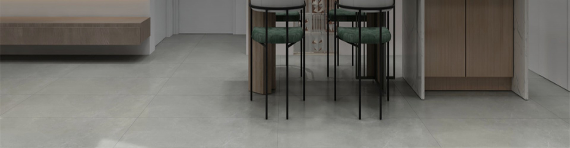
The walls are in a dark green color scheme. The white bed is simple and serene. The combination of dark green and white neither takes away the dominance of the space nor makes it look overly pretentious; instead, it makes the space appear more elegant and natural.
Apart from the large green color of the walls, the furniture in the room can also have corresponding designs, thus enriching the overall layering of the room.
15
Pink/Color Scheme, Sophisticated Nordic Color Palette Rule
Among the popular colors in 2018, the sophisticated pink was undoubtedly the most attractive. Whether in clothing or home decor, it appealed to a large number of people with a strong sense of girl-next-door charm.
Pink is quite diverse. It can be sweet and innocent, romantic and dreamy, or calm and determined. Therefore, it is often seen in the homes of people with different personalities.
Although pink is not easy to match, if not chosen properly, it may appear tacky. However, in daily home decoration, the appropriate use of pink not only adds charm to the home but also affects one's mood. Over time, one's state of mind will become brighter and more youthful.
As the king of versatile colors, grey, when paired with pink (light pink, orchid pink), creates a modern look through a contrast.
The old black leather sofa, combined with the pink surroundings, exudes a refreshing and distinct Nordic style. You are truly a unique person.
Bronze artifacts are increasingly favored by people. When choosing home decorations, bronze has gradually become the top choice, either in its original color or in rose gold. The metallic charm of bronze complements the pink color perfectly, bringing elegance and dreaminess to the home.
The soft pink color blends into the cold and sophisticated grey space, creating a refined, delicate, and trendy modern atmosphere for the living space. It is a classic combination, and with the addition of stylish accessories, it exudes a modern and fashionable vibe.
The children's room would be more suitable for such soft and pastel colors.
If you are not comfortable using large areas of pink paint, you can still change the overall color scheme of the room by using pink items such as bed sheets and throw pillows.
16
Orange-yellow / color range, restoring the bright feeling that life should have
Orange-yellow has a color similar to sunlight. When used in the home, it can bring us a sense of comfort and brightness like the sun, and provide stability and support for an uneasy heart.
In a low-key interior design, a touch of bright yellow is added. The blending of cool and warm tones not only showcases a luxurious and refined style but also perfectly conveys the bright and relaxed feeling that life should have.
Interact with each other, complement each other.
17
The color scheme of the studio can adopt warm tones, such as red and orange. Such a combination can enhance a pleasant mood.。
Heavier colors are generally used in the lower part, while lighter colors are used in the upper part. Otherwise, it would be unbalanced and uncomfortable if the upper part is too heavy.
18
The study must be a quiet space. It should be suitable for reading, studying or thinking. It should not be overly fancy, but neither should it be too dull, as doing so would increase fatigue or cause people to lose interest.
Dark colors are the preferred choice for the color scheme of the study room. Colors with low purity offer more space for thinking. Their blurred color boundaries have the effect of reducing psychological resistance when receiving new knowledge.
19
The color scheme in the foyer can blend with that of the interior and exterior. Because when entering such a space, one can feel throughout that the colors are not abrupt or jarring, but rather smooth and harmonious.
The color scheme of the front hall serves as a precursor to the overall interior color scheme, much like the preface of a novel.
20
A color space dominated by white
White is the color with the best reflectivity on the spectrum, so it is very suitable for rooms with poor lighting. However, color balance is extremely important. If white is used as the main color, then other parts should be chosen to have as bright colors as possible to avoid making the entire space feel harsh and dull.
When you introduce color psychology into your home, choose colors that remind you of the beautiful nature, those that can perfectly exist in nature and also blend perfectly with your home. Colors can also perfectly integrate into your home decoration. Make good use of colors to adjust the home space and give yourself a personalized and comfortable home experience.

点击右上角
分享给朋友吧


 Long by picture save/share
0

The Originator of Textured Art Finishes
SERVICE LINE
86-400-930-3689
FOLLOW US
-
 抖音官方账号
 -
扫码关注公众号
-
扫码关注视频号
-
小红书官方账号


Copyright ©2025 All Rights Reserved Qingda Runcai Coating Co., Ltd., Shunde District, Foshan City
